The Power of Colour: Understanding Colour Theory in Painting
Have you ever wondered why some pieces of clothing don’t go together? You just can’t pinpoint what’s wrong about it but you know that they somehow clash visually?
You might not have realised it, but colour theory plays a huge role in making things look attractive and pleasing to the eye. And we mean in more ways than just how your clothes look on you – colour theory extends into home interior design too.
If you’re in the middle of a home renovation or you’re looking to spruce up your living space, here’s a helpful guide about colour theory.
What is colour theory?
Colour theory is a field of study that explores how colours interact with each other and how they can be organised and used effectively in various visual arts and design applications. It encompasses principles, concepts, and guidelines that help artists, designers, and other creative professionals understand and use colour in a deliberate and meaningful way.
Colour theory involves understanding the colour wheel, which is a visual representation of colours arranged in a circular format. The colour wheel typically includes primary colours (red, blue, and yellow), secondary colours (orange, green, and purple), and tertiary colours (mixtures of primary and secondary colors). The relationship between colours on the colour wheel is the foundation of colour theory.
Key concepts of colour theory
Colour theory encompasses several key concepts that are fundamental to understanding how colours interact with each other and how they can be used effectively in visual arts, design, and other creative fields. Some of the key concepts of colour theory include:
- Colour harmony: Colour harmony refers to the visual pleasing arrangement of colours in a composition. It involves understanding how colours can be combined together in a way that creates a sense of balance, unity, and aesthetic appeal. Techniques such as complementary colours (colours opposite to each other on the colour wheel), analogous colours (colours adjacent to each other on the colour wheel), and colour schemes such as monochromatic, analogous, complementary, and triadic colour schemes are used to create colour harmony.
- Colour value: Value refers to the lightness or darkness of a colour. Understanding value is important in creating contrast, depth, and focal points in a composition. It can be used to create a visual hierarchy and emphasis within a design or artwork.
- Colour saturation: Saturation refers to the intensity or purity of a colour. Highly saturated colors are vibrant and bold, while desaturated colours are more muted or subdued. Saturation can be used to convey emotions, moods, and visual impact in a composition.
- Colour psychology: Colour psychology studies how colours can evoke emotions, moods, and meanings in different cultures and contexts. Different colours are often associated with specific emotions or convey symbolic meanings, and understanding colour psychology can be useful in visual communication and design.
- Colour mixing: Colour mixing involves understanding how colours can be mixed together to create new colours, either through physical mixing (such as with paints) or through optical mixing (such as in digital media or printing). Understanding colour mixing is important in creating desired colour effects and achieving colour accuracy in design and artwork.
- Colour temperature: Colour temperature refers to the warmness or coolness of a colour. Warm colours, such as reds and yellows, are associated with warmth, energy, and excitement, while cool colours, such as blues and greens, are associated with calmness, serenity, and coolness. Understanding colour temperature can be used to create a visual mood and atmosphere in a composition.
These are some of the key concepts of colour theory that provide a foundation for understanding how colours work together and how they can be used effectively in visual arts, design, and other creative fields.
By understanding these concepts, artists and designers can make informed decisions about colour selection, combination, and application in their creative works.
Best colours for your home
The choice of colours for interior design can greatly impact the mood, ambience, and overall aesthetic of a space. Here are some popular colour options that can work well in different rooms and settings and some of our favourite art pieces in each palette:
Neutral Colours
Neutral colours such as white, grey, beige, and taupe are versatile and timeless, making them popular choices for interior design. They can create a clean, serene, and sophisticated look, and serve as a great backdrop for other colours or textures.

Hand Painted Lovers Pastel

Creamy and Blush Hill Impression

Hand Painted Wine and a Good Book
Soft Pastels
Soft pastel colours like light blue, pale pink, and mint green can add a touch of sweetness, playfulness, and charm to a space. They work well in bedrooms, nurseries, and living rooms where you want to create a gentle and calming atmosphere.

Green, Yellow and Blue Abstract Set of 3 Pastel Prints

Pastel Horse and Llama Set of 2 Prints

Pastel Sunset Print
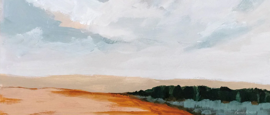
Warm Earth Tones
Warm earth tones like terracotta, caramel, and ochre can create a cozy, inviting, and rustic feel in a space. They work well in living rooms, dining rooms, and kitchens, and can be paired with natural materials like wood or stone for a harmonious look.

Living on Country by Domica Hill

A Forest in Autumn

Look Up Eucalyptus Forest Print
Bold Jewel Tone
Bold jewel tones like emerald green, sapphire blue, and ruby red can add drama, richness, and opulence to a space. They work well as accent colours in small doses or as statement colours in rooms like a study, library, or powder room.

Nighthawks by Edward Hopper Print

Bold Abstract Blue, Grey and Gold Print

Vibrance and Passion Print
Cool Blues and Greens
Cool blues and greens like navy blue, teal, and seafoam green can create a calming and refreshing vibe in a space. They work well in bathrooms, bedrooms, and coastal-themed spaces, and can be paired with white or other neutrals for a crisp and clean look.

Wheatfield with Cypress by Van Gogh Print

Soft Awakening Abstract Print

Wineglass Bay Painting Print
Timeless Gray
Gray is a versatile colour that can range from cool to warm tones, making it a popular choice for interior design. It can create a modern, sophisticated, and timeless look in a space, and can be paired with a variety of colours and styles.

Morning View Art Print

Above Mist Print

Quiet and Calm Print
Ultimately, the best colours for interior design will depend on your personal preferences, the style you want to achieve, and the specific mood or ambiance you want to create in each room. Consider factors such as lighting, room size, and existing furniture or decor when selecting colours to ensure a cohesive and harmonious overall design.
Add colour with wall art from Gioia
If you’re looking for a simple way to improve the colour theory of your home adding new wall art to your home may just be the best way to do so. At Gioia, we can help you there. We’ve got a range of thousands of wall art prints in all kinds of styles like abstract, photography, florals, travel inspired and many many more.
We also ship Australia-wide, so no matter where you are you can enjoy high quality and affordable wall art.

